Source: https://www.clearvuehealth.com/cte/football/
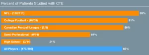
The visualization is a warning against the risk of CTE for football players. It is successful because it visually demonstrates a strong correlation between CTE and prior football experience. The almost hundred percent for NFL players was most convincing since I have heard about the high number of NFL players being diagnosed with CTE after their deaths, making the other categories above semi-professional more believable. The piecework would work without the visualization, but the bar graph makes it seem more severe and tangible. A pie chart could also work with the data because it would still show the feeling of most players having CTE. Dr. Charles Li, who got his M.D. from Yale, created this visualization. He has other publications on genomics and brain-related diseases.
The intended audience of this visualization is people who are not aware of the dangers of football, and it reinforces this idea in people who already believe it. The visualization could also be used by health advocates who believe the NFL should change regulations to make the sport safer for its players. The context is a publication by Dr. Li on Clearvue Health, a website for health visualizations. The source of this data is a study in 2017 by three people, including two doctors. The data is from a sample of two hundred and two deceased players whose brains they tested for CTE. The visualization appears biased since the bottom bar chart has an “all players” bar, even though most of the people in the survey had played above the college level. That percentage could easily be manipulated, for example, by adding more NFL players to increase or by more high school players to lower the percentage. Therefore if they wanted to make football appear more dangerous, they could add more NFL players to the sample.