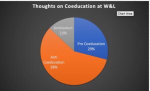
Of the 74 letters written by Alumni from March 27, 1984, to May 7, 1984, the following opinions were shown.
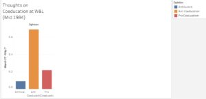
https://public.tableau.com/views/bargraph_16780670078320/Sheet1?:language=en-US&:display_count=n&:origin=viz_share_link
I enjoyed learning how to craft these visualizations, especially the one on Tableau public. I found the excel ones more straightforward due to my prior experience with excel. However, Tableau public was challenging at first. I did not understand how to import data or make graphs, so Iooked it up on the Tableau public help website and youtube. I think Youtube was more helpful because I could follow the steps and visually see what I had to do. Aside from these two, there were many more resources I could have used for help. Once done, I published my visualization on my profile; therefore, it is very accessible since it can be found by searching for my profile. If I had more time, I would use more complex visualizations on Tableau public and add more data from other sources. I could visceralize my visualizations by including how the opinions have affected morale at the school. For example, I could show the amount of anti-Coeducation opinions and how it has severely hindered the morale of current or potential future students.